So when a friend sent me a link to the Lightroom 4 beta download, I decided to give it a try. It's always fun to see what the software companies are doing. The beta comes with a bunch of warnings about how it can be buggy, crash and so on, so it is always a risk installing something like this. But no worries, they don't allow you to update your Lightroom 3 image catalog, so your existing images and edits and safe.
There are a good number of changes to the software that I won't really try out as they don't interest me and I don't currently use them. Such as a new map that shows the location of your images and a Book module that seems to be linked to Blurb (actually, looks cool).
I'm really curious about the changes to the image processing. In my image processing, I'm usually tweaking exposure, contrast, clarity, fill / recovery light, highlights/shadows, white balance, saturation and then noise and sharpening if needed.
Note that my testing is usually pretty simplistic. I'll stick with one adjustment slider, crank it to the max and then the min. I'll compare with the same thing in Lightroom 3. I'll throw in some various sliders, try and do the same thing I normally do in Lightroom 3 and compare the end results.
So my first stop is the Clarity slider. I love Clarity in Lightroom 3 for urban shots. I find it's great around 50-70% where there are lines and detail in the image. I use it sparingly for people shots, maybe 5-10% as I don't like the effect too much. It tends to bring out wrinkles in the face and give the subject a very harsh look, without adding much interest to the image.
For this test, I took an image of Tim Lambesis, lead singer of As I Lay Dying from the Heavy MTL festival. A rare moment where he isn't jumping around. This first image is straight out of the camera, no edits other than whatever default Lightroom 4 has in there (which is typically just sharpening for export).

Slightly under exposed, but a decent image to try out the Clarity slider. The light is a bit flat so the clarity shouldn't hurt the facial details too much, but I really like the murky background. This would be an image I pump a little more Clarity into.
So in Lightroom 4, all I did was max the Clarity to 100% and this is what I get. Take note of the changes in the hair and also in the tattoos.
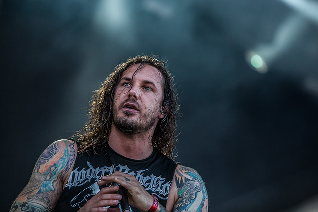
I am really liking the effect. While at 100% it is a bit harsh (but then, there is no better way to get the full appreciation of the processing it is doing than going max), I am really digging the contrast and variances it is throwing in the detail. The face is brighter, the hair really pops. I'm not a fan of how it turned the lettering on his shirt grey, but what can you do.
For fun, here is what maxed Clarity looks like in Lightroom 3. Not as intense as the new Lightroom 4, probably more on the realistic side, but I like how I can adjust the Lightroom 4 version to really pump out the details or tone it down for just a little bit. I rather have the option than no option at all.

Pretty straight forward. Next up, I'll be working on my favorite set of adjustments next, the highlights, shadows, whites, darks... or the things that add contrast into an image!
No comments:
Post a Comment