Saturday, January 14, 2012

Lightroom 4 beta - highlights and all that jazz

I'm having too much fun with the new Lightroom 4 beta. If you want the basic intro bla bla bla to what I am doing, look at my prior post on Clarity. I'm too lazy to repeat myself.

The next major component that I live off of in photo editing is the tones (I think that's what it is called). This is where you set the contrast, exposure and other fun things.

Lightroom 3 had a series of adjustment sliders that were practical, but if pushed too far, made the image look a wee bit crappy. Exposure, recovery, fill, black, brightness, contrast. These have been redesigned for Lightroom 4 and are now exposure, contrast, highlights, shadows, whites and blacks.

Playing around with them, they seem to do a similar job, however, they allow you greater control over the tone details. Here is an example of some tweaking I did, again, using my "push the slider to the max" uber testing method.


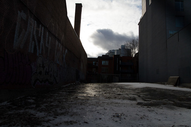
This is the straight out of camera image. I know, I know. It is pretty damn dark. Well, this image was part of a 5 shot HDR (where you merge variously exposed images into 1). This was purposely done at a -2 exposure level. But I thought it would be a great candidate to test out how Lightroom 4 will work at filling in shadows and dark spots, without killing the image quality.


Well, I think the image speaks for itself! From that dark image, I maxed out the highlights, shadows and whites and I ended up with a pretty decent image which retained a good amount of detail.

*a little note here that I always shoot in RAW, rarely in JPG. The reason is that the RAW file will contain ALOT more data than the JPG, which compresses the data into a smaller file size. A typical RAW would be around 21 mb while the equivalent JPG would be about 12 mb, or half the size. So this type of adjustment may not be possible with a JPG.*

With many of my urban shoots, I love to add some clarity. After my last tests with the new clarity slider, I decided to also use it on this one (and once again, maaaaxed out). Here is what my adjustment sliders looked like for this final test image.
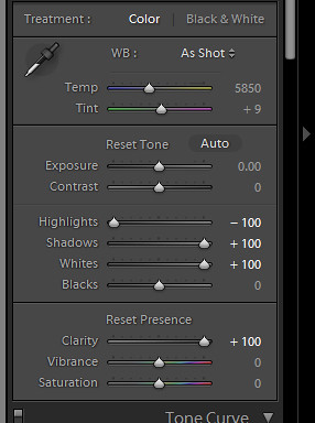


Yep... maxed out.


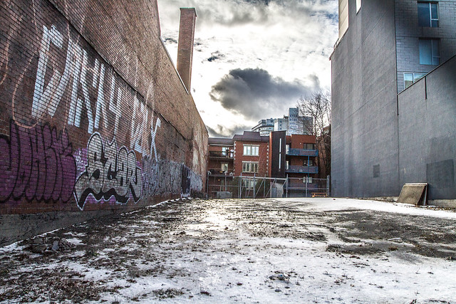
Ok, now this is getting inter-resting! From LR4 sliders only, I'm getting an HDR feel to this image. A bit surrealist / exaggerated, but still not totally over the top!

And for a point of reference, here is similar processing of the same under exposed image done in Lightroom 3 (recovery, fill, clarity all maxed). Similar effect, but not as punchy. Look at the clouds in the two images or even the level of "grit" on the floor.


The whole point of posting these maxed out adjustments is not to show how crazy you can make an image, but to visually explain that while you can push things to a much funkier max, you now have alot more flexibility in the in between levels.

Not sure how much more time I'll have with the software, I'm hoping to push through some portrait adjustments and try out the new brushes.

Friday, January 13, 2012

Lightroom 4 beta testing - Clarity

My choice software for editing is Adobe's Lightroom 3. Why LR? It is fast. The workflow I have with the software gets me through an entire set of show images, selected, edited, exported, watermarked, usually in under an hour. It's a godsend for me.

So when a friend sent me a link to the Lightroom 4 beta download, I decided to give it a try. It's always fun to see what the software companies are doing. The beta comes with a bunch of warnings about how it can be buggy, crash and so on, so it is always a risk installing something like this. But no worries, they don't allow you to update your Lightroom 3 image catalog, so your existing images and edits and safe.

There are a good number of changes to the software that I won't really try out as they don't interest me and I don't currently use them. Such as a new map that shows the location of your images and a Book module that seems to be linked to Blurb (actually, looks cool).

I'm really curious about the changes to the image processing. In my image processing, I'm usually tweaking exposure, contrast, clarity, fill / recovery light, highlights/shadows, white balance, saturation and then noise and sharpening if needed.

Note that my testing is usually pretty simplistic. I'll stick with one adjustment slider, crank it to the max and then the min. I'll compare with the same thing in Lightroom 3. I'll throw in some various sliders, try and do the same thing I normally do in Lightroom 3 and compare the end results.

So my first stop is the Clarity slider. I love Clarity in Lightroom 3 for urban shots. I find it's great around 50-70% where there are lines and detail in the image. I use it sparingly for people shots, maybe 5-10% as I don't like the effect too much. It tends to bring out wrinkles in the face and give the subject a very harsh look, without adding much interest to the image.

For this test, I took an image of Tim Lambesis, lead singer of As I Lay Dying from the Heavy MTL festival. A rare moment where he isn't jumping around. This first image is straight out of the camera, no edits other than whatever default Lightroom 4 has in there (which is typically just sharpening for export).


Slightly under exposed, but a decent image to try out the Clarity slider. The light is a bit flat so the clarity shouldn't hurt the facial details too much, but I really like the murky background. This would be an image I pump a little more Clarity into.

So in Lightroom 4, all I did was max the Clarity to 100% and this is what I get. Take note of the changes in the hair and also in the tattoos.


I am really liking the effect. While at 100% it is a bit harsh (but then, there is no better way to get the full appreciation of the processing it is doing than going max), I am really digging the contrast and variances it is throwing in the detail. The face is brighter, the hair really pops. I'm not a fan of how it turned the lettering on his shirt grey, but what can you do.

For fun, here is what maxed Clarity looks like in Lightroom 3. Not as intense as the new Lightroom 4, probably more on the realistic side, but I like how I can adjust the Lightroom 4 version to really pump out the details or tone it down for just a little bit. I rather have the option than no option at all.


Pretty straight forward. Next up, I'll be working on my favorite set of adjustments next, the highlights, shadows, whites, darks... or the things that add contrast into an image!